All Projects
Hollywoodbets · Web App · UX
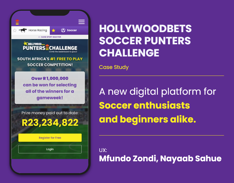
Soccer Punters Challenge
Brand new platform. R23M+ already paid out. The brief: make it work for someone who has never filled in a pick before. We started from scratch.
Brand new platform. R23M+ already paid out. The brief: make it work for someone who has never filled in a pick before. We started from scratch.
Soccer Punters needed to onboard complete beginners alongside seasoned punters. The home screen had to work for both audiences without alienating either, and do it fast.
Benchmark against Fantasy Premier League and design for the beginner mental model first. If a first-timer can figure it out in 30 seconds, a veteran can too.
Before wireframing anything, we needed to understand who was arriving on the platform and why. Soccer Punters had to serve two audiences with very different mental models: casual fans drawn by the prize pool, and seasoned PSL punters who wanted speed and form data.
Research surfaced one core tension: beginners need simplicity and veterans need speed. These are not the same thing. The design challenge was to make the beginner experience invisible to experts, and expert features discoverable for beginners.
| Phase | User Action | Pain Point Identified | Design Response |
|---|---|---|---|
| Discover | Lands on home screen | No clear signal this is a competition, looked like a general sports news page | Prize amount as hero element, competition CTA front and centre within 3 seconds |
| Register | Signs up or logs in | Registration had too many required fields, users dropped before completing | Streamlined sign-up, progressive disclosure of optional profile details |
| Pick | Selects match outcomes | Match cards showed insufficient context for confident picks | Football-card UI with deadline countdown visible per gameweek |
| Track | Checks score and rank | Leaderboard took too long to load, rank required scrolling to find | Rank pinned at top of leaderboard view, live update indicator |
If a first-timer can figure it out in 30 seconds without reading anything, a veteran can too. Design for the beginner mental model first, the expert will not be slowed down by clarity.
With two personas and a resolved design principle, ideation focused on three structural questions: how do we surface the prize before the mechanics, how do we make picks feel like football (not admin), and how do we let experienced users move fast without confusing newcomers.
Research showed the R23M+ prize was the #1 reason new users registered. The prize amount needed to be visible within 3 seconds of arriving, not after scrolling, not after signing up.
Explored football card-style UI versus list and table approaches. Football cards mapped to how fans already think about matches, home vs away, with team colours and recognisable match context.
First-time experience shows only the essential choices. Advanced filters, form data, and historical stats are available but not surfaced until the user signals they want them, one tap to reveal depth.
Clear Horse Racing / Soccer toggle at the app level, allows the platform to grow multi-sport without requiring separate apps or confusing existing users.
R23M+ prize amount front and centre on the landing screen. Validated in research as the #1 driver for new users pressing Register, show the reward before the mechanic.
Football-card-style picks interface. Select winners per match in a gameweek. Progress indicator shows picks made vs outstanding. Clear submission CTA with deadline countdown.
Collaborating with Nayaab Sahue on this project made a real difference, a second designer to challenge assumptions and stress-test flows. Soccer Punters showed me that great onboarding is the highest-leverage UX work you can do on a new platform.