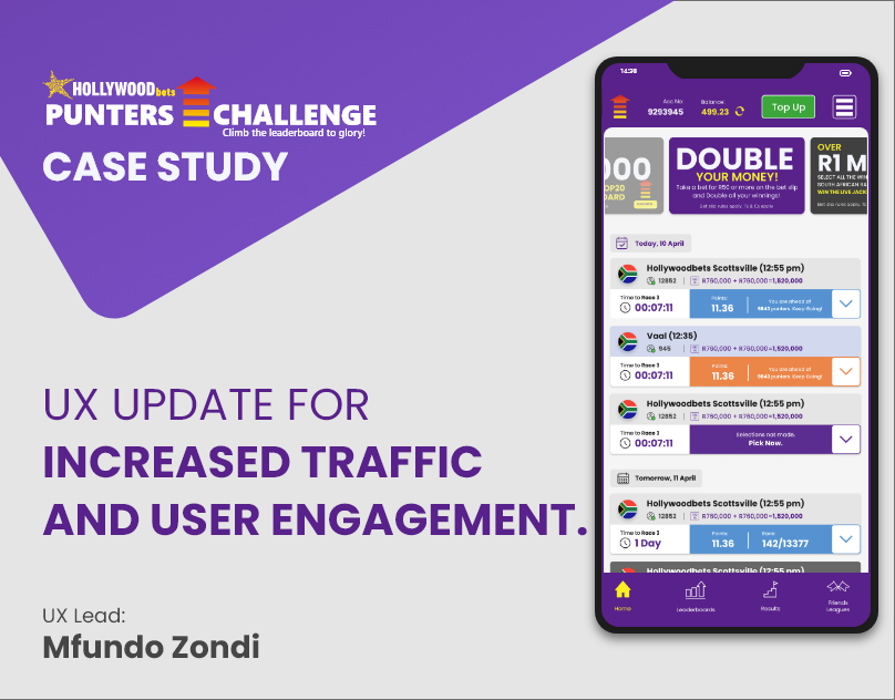
1.
Improve Usability
Redesigned information hierarchy across all screens. Leaderboard rank pinned visible. Race details structured with clear visual weight. “What’s happening now” answered before anything else. Dense data made scannable through consistent typographic scale and colour coding by race status.
2.
Improve Navigability
Rebuilt the navigation architecture. Today’s races and Upcoming separated into a persistent toggle on the dashboard. Bottom nav for primary flows. Zero dead ends. Every screen has a clear next action, race selection, leaderboard, results, or jackpot, one tap away.
3.
Increase Traffic & Engagement
High-visibility Double Your Money banner repositioned above the fold. Push notification triggers for race start, leaderboard changes, and results. Designed to create return-visit habits; if you check your rank once, the UI makes it feel natural to check again after the next race.