All Projects
Hollywoodbets · Web · UX Lead
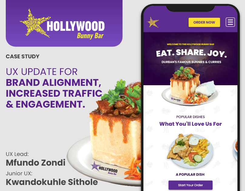
Hollywood Bunny Bar
Durban's most-argued-about restaurant. The food is iconic. The website was not. I rebuilt it so walking in and clicking through felt like the same brand.
Durban's most-argued-about restaurant. The food is iconic. The website was not. I rebuilt it so walking in and clicking through felt like the same brand.
The Bunny Bar has a personality the moment you walk in. Loud, warm, food everywhere. The old website was beige. People were landing and leaving before they ever got to the menu.
Make it feel like the restaurant. And get people to the Order button faster. WordPress was already in place so the build had to work within that.
'Eat. Share. Joy.' elevated to headline status. Full-width food photography, bold purple brand colours, and a prominent Order Now CTA, reduced time-to-first-action significantly.
'What You'll Love Us For', visual food cards linking directly to the menu. Replaces the previous text-heavy list, appetite-triggering and instantly scannable.
Over 70% of restaurant web traffic is mobile. Sticky header with Order Now CTA, thumb-friendly card sizes, and performance-optimised imagery across the board.
Sometimes the design job is not to invent something. It is to stop the digital version from lying about what the place actually is. The Bunny Bar had everything it needed. I just got out of the way.