All Projects
Hollywoodbets · Non-Profit Web · UX Lead
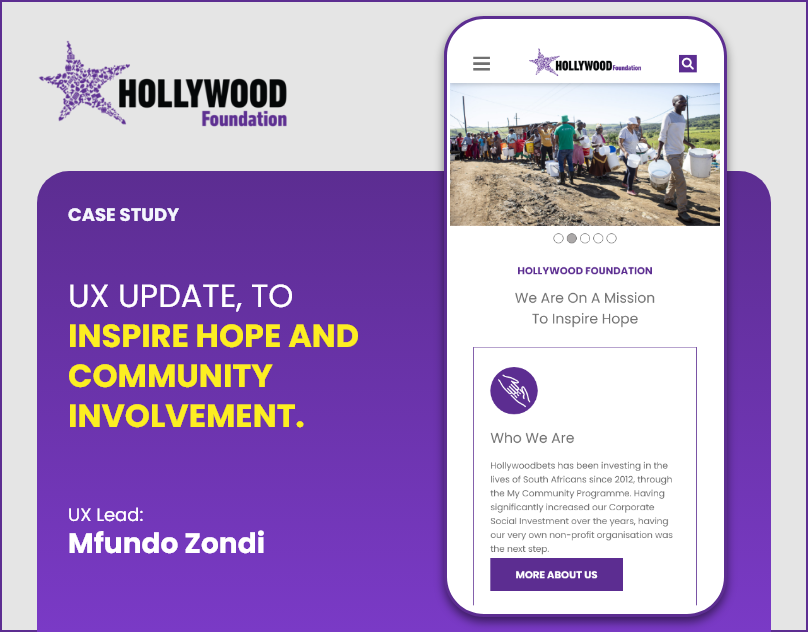
Hollywood Foundation
The Hollywood Foundation does real work in SA communities. The website did not show any of it. I rebuilt it so the work speaks for itself.
The Hollywood Foundation does real work in SA communities. The website did not show any of it. I rebuilt it so the work speaks for itself.
Twelve years of community investment. School programmes, bursaries, disaster relief. None of it was legible on the site. First-time visitors had no idea what the Foundation actually did or how to be part of it.
Lead with the people. Impact numbers that mean something. A clear path to getting involved. If someone leaves the site feeling nothing, the design has failed.
Leading with real impact imagery, people, not logos. 'We Are On A Mission to Inspire Hope' retained as the headline after testing strongly with users in multiple rounds.
Clear, scannable explainer of the Foundation's history and mandate, written for a first-time visitor, not corporate stakeholders.
As a non-profit targeting a broad SA audience across devices and connection speeds: high contrast ratios, readable font sizes, and performance-optimised imagery throughout.
You are not selling anything. You are asking people to care. That is a different design problem. Getting trust without a transaction, getting action without urgency. I learned more about emotional design here than almost anywhere else.